Food Hygiene
 Health & Safety
 Safeguarding
 First Aid
 Business Skills
 Personal Development


£20
ex Vat
TAKE THIS COURSE
SAVE 84% - OFFER ENDS SOON
- Original price was: £125.00.£20.00Current price is: £20.00. ex Vat
- 1 year
- Intermediate
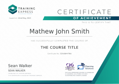
- Course Certificate
- 3 hours, 41 minutes Gift this course
Subscribe to this course and 2,000+ top‑rated Training Express courses for your organization.
Try Training Express Business- For teams of 5 or more users
- 2,000+ fresh & in-demand courses
- Learning Engagement tools
- SSO and LMS Integrations
Instructors
6 STUDENTS ENROLLED