Food Hygiene
 Health & Safety
 Safeguarding
 First Aid
 Business Skills
 Personal Development


Course Curriculum
| Setup & Installation | |||
| Installing the Anaconda Navigator | 00:07:00 | ||
| Installing Matplotlib, seaborn & cufflinks | 00:03:00 | ||
| Reading data from a csv file with pandas | 00:03:00 | ||
| Explaining Matplotlib libraries apart | 00:07:00 | ||
| Plotting Line Plots with matplotlib | |||
| Changing the axis scales | 00:06:00 | ||
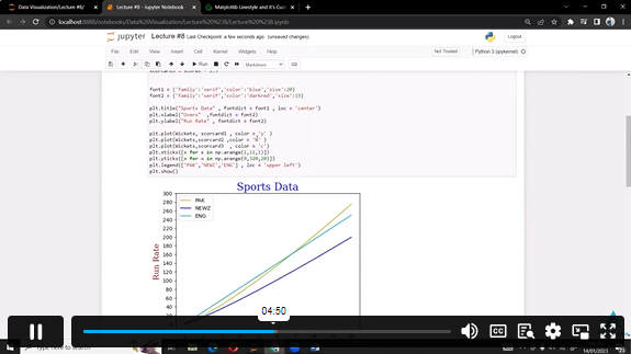
| Label Styling | 00:04:00 | ||
| Adding a legend | 00:04:00 | ||
| Changing colors, linestyles, linewidth and markers | 00:06:00 | ||
| Adding a grid to the chart | 00:04:00 | ||
| Filling only a specific area | 00:07:00 | ||
| Filling area on line plots and filling only specific area | 00:04:00 | ||
| Changing fill color of different areas (negative vs positive for example) | 00:03:00 | ||
| Plotting Histograms & Bar Charts with matplotlib | |||
| Changing edge color and adding shadow on the edge | 00:04:00 | ||
| Adding legends, titles, location and rotating pie chart | 00:06:00 | ||
| Histograms vs Bar charts (Part 1) | 00:03:00 | ||
| Histograms vs Bar charts (Part 2) | 00:02:00 | ||
| Changing edge colour of the histogram | 00:03:00 | ||
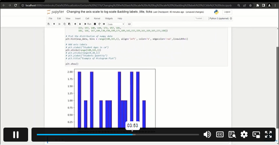
| Changing the axis scale to log scale | 00:07:00 | ||
| Adding median to histogram | 00:04:00 | ||
| Advanced Histograms and Patches (Part 1) | 00:04:00 | ||
| Advanced Histograms and Patches (Part 2) | 00:05:00 | ||
| Overlaying bar plots on top of each other (Part 1) | 00:04:00 | ||
| Overlaying bar plots on top of each other (Part 2) | 00:01:00 | ||
| Creating Box and Whisker Plots | 00:11:00 | ||
| Plotting Stack Plots & Stem Plots | |||
| Plotting a basic stack plot | 00:13:00 | ||
| Plotting a stem plot | 00:05:00 | ||
| Plotting a stack plot od data with constant total | 00:04:00 | ||
| Plotting Scatter Plots with matplotlib | |||
| Plotting a basic scatter plot | 00:06:00 | ||
| Changing the size of the dots | 00:06:00 | ||
| Changing colors of markers | 00:05:00 | ||
| Adding edges to dots | 00:04:00 | ||
| Time Series Data Visualization with matplotlib | |||
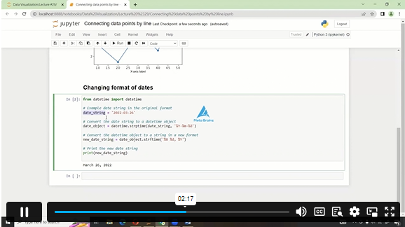
| Using the Python datetime module | 00:03:00 | ||
| Connecting data points by line | 00:04:00 | ||
| Converting string dates using the .to_datetime() pandas method | 00:05:00 | ||
| Plotting live data using FuncAnimation in matplotlib | 00:04:00 | ||
| Creating multiple subplots | |||
| Setting up the number of rows and columns | 00:04:00 | ||
| Plotting multiple plots in one figure | 00:02:00 | ||
| Getting separate figures | 00:03:00 | ||
| Saving figures to your computer | 00:03:00 | ||
| Plotting charts using seaborn | |||
| Introduction to seaborn | 00:02:00 | ||
| Working on hue, style and size in seaborn | 00:05:00 | ||
| Subplots using seaborn | 00:05:00 | ||
| Line plots | 00:02:00 | ||
| Cat plots | 00:03:00 | ||
| Jointplot, pair plot and regression plot | 00:02:00 | ||
| Controlling Plotted Figure Aesthetics | 00:03:00 | ||
| Plotly and Cufflinks | |||
| Installation and Setup | 00:02:00 | ||
| Line, Scatter, Bar, box and area plot | 00:07:00 | ||
| 3D plots, spread plot and hist plot, bubble plot, and heatmap | 00:07:00 | ||
£20
ex Vat
TAKE THIS COURSE
SAVE 84% - OFFER ENDS SOON
- Original price was: £125.00.£20.00Current price is: £20.00. ex Vat
- 1 year
- Intermediate
- Course Certificate
- 3 hours, 41 minutes Gift this course
Buying more than one of the same courses?
- 50% discount for orders of 10+ courses
- 60% discount for orders of 50+ courses
- 70% discount for orders of 100+ courses
Looking for a more personalised package?
contact us nowInstructors
9 STUDENTS ENROLLED